A Big Slice of Pi
 OK, I’ve gone off the deep end by laboriously designing a book nobody will ever read. Actually, that may be no different than my usual book designs, but in this case the book is composed of one million digits of pi, the irrational, never-ending number from high school geometry.
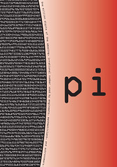
 In the era of the microchip and the supercomputer, a million decimals of pi is no big deal, but having it in a book kind of is. I assumed there was no other book like this out there, but The Joy of Pi by David Blatner has a million digits crammed into the margins, accompanied by jokes, history, and a lot of other math-geeky stuff.
I think my version is more arty-looking than the Blatner book, though that one does use Emigre’s Tall Matrix — a very hip font. I used the bar code font OCRA for the numbers, a surprisingly cool-looking early digital font that is almost never used for text. The ubiquitous Monotype Times New Roman is used for the short introduction and back cover text. Oh, and there’s monotype Symbol, the greek alphabet that is designed to coordinate with Times. The curves are my favorite part of the design though, since they imply the meaning of the text. Pi is a ratio describing the relationship of circles to squares, it seems perfect to set the digits in curved columns (although technically they are not columns since they read across, not down.)
So download this ebook for the engineers, and math whizzes (eew!) among us, but forward a copy to the design geeks too. As always, comment away.
posted by Todd Duren at 3:36 PM
![]()
![]()


0 Comments:
Post a Comment
<< Home