Voices Poster
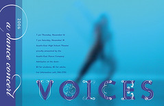
It’s all smoke and mirrors: a blue blur and a bunch of curlicues. My latest design for the annual Voices dance concert just came back from the printer, and I’m happy with it. I’ve always wanted to use the Missionary font in a design, and I think it works here. This wispy, elegant design by Miles Newlyn blew my mind when I saw it in Emigre’s catalog in 1991. The thin, ornate victorian strokes outline implied postmodern letterforms. Here I resort to using London Between by François Bruel to punch up the readability. I got a guilty pleasure out of downloading a free font. Ah, the smell of ink on paper!
posted by Todd Duren at 3:50 PM
![]()
![]()


0 Comments:
Post a Comment
<< Home