An educator bloogging about graphic design.

Wednesday, May 31, 2006

It’s only rock and roll… but I like it

plaugue

I recently got my first tattoo (see the story in one of my other blogs) and ran into an honest-to-goodness graphic designer.

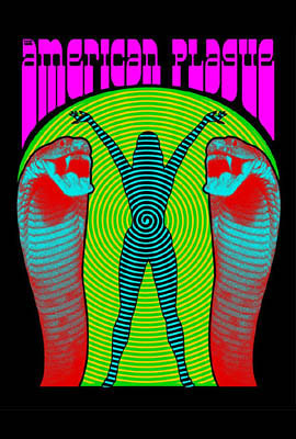
Johnny Hicks was our “concierge” at Saint Tattoo — the guy who answered all our questions and set us up with the tattoo artists. Turns out Johnny has designed some killer posters for bands playing local venues. He does a mean Elvis impersonation as well. His dramatic display type and surreal images really grab the eyeballs.

He also told me his work has been included in The Art of Modern Rock, a serious tome of coffee table coolness that I’ve seen in the window at Yee Haw downtown. He may be included in another upcoming book as well. So check out Johnny’s work at the Saint portfolio page or at another spot here. And if you want to be a Johnny Hicks groupie, shoot him an adoring email.

Rock on!

Tuesday, May 23, 2006

Student Book Designs

Yellow Room Relativity

Human Understanding Dream Psychology

I’ve finally found the time and resources to begin posting my students’ book designs from the Digital Graphic Design I course at Pellissippi State Technical Community College. Each design is a PDF file that can be easily downloaded and read onscreen printed. Click here for Free File Hosting

These designs are from my most recent course this past spring. Each of these students downloaded a basic text file from Project Gutenberg, edited it to fix spacing and punctuation problems, and created an original design for the text and cover that includes a cover, title page, and typeset chapters. These beautifully-designed books include:

  • The Mystery of the Yellow Room by Gaston Leroux. Design by Heather Burson.
  • Relativity: The Special and General Theory by Albert Einstein. Design by Roaslie Hadley.
  • An Enquiry Concerning Human Understanding by David Hume. Design by Elizabeth Vanderford.
  • Dream Psychology by Sigmund Freud. Design by Jessica McLaughlin.

A Big Slice of Pi

PiOK, I’ve gone off the deep end by laboriously designing a book nobody will ever read. Actually, that may be no different than my usual book designs, but in this case the book is composed of one million digits of pi, the irrational, never-ending number from high school geometry.

In the era of the microchip and the supercomputer, a million decimals of pi is no big deal, but having it in a book kind of is. I assumed there was no other book like this out there, but The Joy of Pi by David Blatner has a million digits crammed into the margins, accompanied by jokes, history, and a lot of other math-geeky stuff.

I think my version is more arty-looking than the Blatner book, though that one does use Emigre’s Tall Matrix — a very hip font. I used the bar code font OCRA for the numbers, a surprisingly cool-looking early digital font that is almost never used for text. The ubiquitous Monotype Times New Roman is used for the short introduction and back cover text. Oh, and there’s monotype Symbol, the greek alphabet that is designed to coordinate with Times. The curves are my favorite part of the design though, since they imply the meaning of the text. Pi is a ratio describing the relationship of circles to squares, it seems perfect to set the digits in curved columns (although technically they are not columns since they read across, not down.)

So download this ebook for the engineers, and math whizzes (eew!) among us, but forward a copy to the design geeks too. As always, comment away.

Monday, May 22, 2006

Thinking with Type

I’ve been reading the new typography book we’ve adopted, and I really like its approach. It’s Thinking with Type by Ellen Lupton, authour of several other books, and design professor at Maryland Institute College of Art.

I suggested we adopt the book because it is clear and well-written, balancing history, theory, and practice in a succinct and well-written book. Lupton writes from a contemporary perspective without ignoring previous styles and theories. The rich assortment of illustrations range from a 1456 bible page by Johan Gutenberg to a 1990 book design by my grad school’s design professor Katherine McCoy. The author also has a website with additional resources.

Here’s a couple of interesting projects from Lupton’s book:
Letter Exercise Using graph paper or Illustrator, create a grid a certain number of squares high by a certain number wide. Design an alphabet within that rectangle.
Word Exercise Using Futura Bold in black only, design each of the following words on an 8 inch square to convey its meaning: transition, disruption, compression, expansion, migration, elimination, repetition. Letters may be shifted or repositioned but not distorted.

Wednesday, May 17, 2006

New Classic Book Designs

Hamlet Pride&PredjudiceI’m enjoying my summer so far, and have been indulging my addiction to book design. Here are cover images for my latest projects. The first I did a few weeks ago while I was teaching my students book design. Hamlet is the first play I’ve designed, and the page layout was a challenge with hanging indents, tabs, and poetry line breaks throughout. My approach was very cool and calculated, a clean sans serif design with a little ornamented script as icing on the cake.

The second image is my cover for Jane Austin’s classic novel Pride and Prejudice. This one is a more traditional design set in Adobe Jenson Pro. I managed to get all 254 pages to bottom out correctly with run-in chapter heads since there are 61 of the things. Karen and I watched the latest film version last night, starring Keira Knightley and Matthew Macfadyen. I worked on the design on my Mac laptop while we watched it, and it still made an impression. It is a costume drama that surpasses the genre, and is full of great acting.

Click on the book covers to download the PDF, or click on my photo to go to my profile and send me an email. They can be read onscreen or printed to an office printer. I’m using Files.bz for free file hosting.