An educator bloogging about graphic design.

Saturday, October 28, 2006

Design Imitates Life

BOARD2If you’ve driven along I-40 east into downtown Knoxville, you may have seen this billboard and done a doubletake. Baptist Creative Manager Kieth Grubb created this new campaign that imitatesinterstate signage with a clever message. An article in the Knoxville News-Sentinnel suggests Baptist may be breaking the law, and could be asked to remove the sign(s) by the Tennessee Department of Transportation.

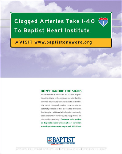
Here’s my interview with Kieth:
    Q: The concept of this outdoor and print campaign is really clever. Can you tell me about its development?
    A: The idea was developed after photographing the billboard sites we have. Noticing the TDOT wayfinding signs near the billboard, I thought hmmmm…
    Q: You are the Creative Manager for Baptist’s marketing department. Did you pitch the idea to the rest of the marketing department? What was the response?
    A: I discussed the concept with the Marketing Director, our Heart Institute Director and Baptist West Administrator, (the two “product lines” featured on the boards) and we ran with it. We have had a huge positive response to the boards and the News-Sentinel article is simply more publicity. 1965 Beautification Act? Give me a break.
    Q: How did you get the information on typeface and color that helped you mimic the look of interstate signage?
    A: That’s the funny part. I sent an e-mail to TDOT explaining that we were planning on simulating their signs as part of an ad campaign, and would they mind advising us on colors and type. They responded with a PDF which described exaxtly how to design it, including the PANTONE color (356 for the Green) and the chromium levels in the paint. The typeface was custom-designed for the highway department. I found an identical one for free on the Web called “Roadgeek”.
    Q: TDOT has pointed out a law that prevents advertisers from imitating directional signs. How will Baptist respond? Will you remove the signs and keep the print ads, alter the signs, or scrap the whole campaign?
    A: As of today, we have no official notification from TDOT or the outdoor companies. I’m certain that will accelerate after the News-Sentinel story. On Wednesday of last week, when we learned of the article, I booked ads featuring the “TDOT Concept” in the Sentinel for Saturday and Sunday. If we receive an official notification, plans are to change the art, not being in our best interest to draw a line in the sand with the people that have their own police force. I will increase the frequency of the print ads to take advantage of the publicity. If people think of Baptist every time they see a TDOT sign, then hooray.
    Q: This is a very creative campaign for a healthcare company. Do you think Baptist will pull back to more traditional advertising?
    A: I may think differently if I’m packing up my office on Monday but my answer today is absolutely not. I consider it our role as creatives to constantly push for unique solutions that break through the clutter. No one writes articles about or remembers traditional advertising (or it’s product), whether it’s healthcare or beer.

Friday, October 27, 2006

Student Libri Vox Designs

This Open Door Design project has been several months in the making, and here are the results. My Design I students at Pellissippi State designed these CD covers as portfolio-quality work to be uploaded and shared with the world online. Some special folks from Canada to New Orleans have been waiting to see these covers, and I hope they enjoy using them as much as we enjoyed creating them.

The public domain audio recordings are available for free online at Libri Vox, a great new all-volunteer open source project creating audio files of public domain texts. PDF files of the designs will be added to their site so teachers, librarians, and other users can download, print, and burn their own free and legal CDs, complete with cover art and playlists. All designs and illustrations are credited and licenced under Creative Commons so they can be distributed for free.

As our small contribution to recovery from Hurricane Katrina, copies of these audiobooks will be donated to the New Orleans Public Library. Special thanks to Jan Barnes for accepting these CDs!

Here's an email from NOLA aquisitions librarian Jan Barnes:

Todd:

I love them! I'm especially taken with the Grimm cover. Way cool. And thanks for linking to the Library's website. That's so cool!

Peace!
Jan


Please leave comments below each image: students crave feedback. Look for PDF links to be added soon, and for uploads to Libri Vox to be created as well.

I Have a Dream

JenkinsAudiobook2
Creative Commons License Design by Charles Jenkins.

Give Me Liberty or Give Me Death

DosSantosAudiobook
Creative Commons License Design by Melissa Dos Santos.

American Indian Fairy Tales

buckleyaudiobook
Creative Commons License Design by Jill Buckley.

Fairy Tales by the Brothers Grimm

baileyaudiobook2
Creative Commons License Design by Bailey Smith.

The Communist Manifesto

Greenleafaudiobook
Creative Commons License Design by Nathan Greenleaf.

Thursday, October 26, 2006

Five Children and It

araiaudiobook
Creative Commons License Design by Satoko Arai.

Friday, October 20, 2006

New Typography Links

Picture 1

Typography. The bottomless well of practical creativity that keeps us from dying in the desert of design boredom. Remember: you can design without images, but if there ain’t no type (or at least linguistic symbols), it ain’t graphic design. These links include foundries, portfolio inspiration, articles, films, and everyone’s favorite: free resources. Drink up!

Foundries
Linotype The grandaddy gorilla of hot metal type. Alive and kickin’.
Monotype Another hot metal survivor with digital originals.
International Typographic Corporation The industry leader in phototypesetting fonts in the 70s
Emigre The magazine that started the foundry that started the revolution.
Hoefler & Frere-Jones The Batman and Robin of contemporary typography.
Veer Type, Illustrations, Photos, and (drumroll) type geekwear!

Portfolio Inspiration
Si Scott Typography that grows vines, ornaments, and doo-dads. Amazing.
Yee Haw Industries Local heros with a national reputation
Hatch Show Print The grandaddy of Letterpress poster shops
David Carson He breaks five typographic rules before breakfast.
Neville Brody Typographic stylemaker

Reading About Type
MyFonts Musings A typography blog
U&LCThe iconoclastic 70s/80s type magazine is now online. Here a few fave articles:
Headlines
Type Hierarchy
ITC Founder’s Caslon
Breaking the Web
Laurentian Canadian Magazine’s commissioned font by Rod McDonald
What Makes a Good Text Typeface?
Kerning in Quark and InDesign
Visual Alignment Making it crooked to look straight.

Free Resources
DAFont Free Fonts organized by theme
MyFonts The who, what, and when of typography. Ugly but useful.
WhatTheFont Your font identified. Amazing! Stupendous!
Cooper Black short film. The life, loves, and memories of a classic.

Thursday, October 19, 2006

Briar Press

cut-cornerA student of mine turned me on to this great letterpress site. Briar Press has an online glossary, discussion board, online museum, and some great free cuts and caps that are perfect for that letterpress feel. And even better, I now know what the heck a “bodkin” is!