Melissa Parker: American Apparel
 Congratulations! Melissa's pitch was chosen and she is now an art director, creating a campaign based on this ad. The American Apparel team includes Dennis and Patrick.
posted by Todd Duren at 3:00 PM
![]()
![]()


7 Comments:
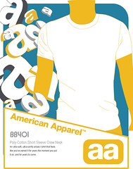
the vector art is great here and i really like the decorative a's. the shape at the bottom creates a very dynamic flow.
6:54 PM
I see how this could be a good campaign. Everything has some good unity and style. Illustration is really nice. Muted colors work well with the modern style.
7:27 PM
I love the illustration work. You have my vote.
D. White
3:30 PM
this is oh-so-nice! i love the repeated floating a's and the colors you chose. i think this concept is perfect for a campaign (especially for store signage). i place my vote!
4:40 PM
This would be a great change of pace from their current marketing campaign. The repetition of the aa's really creates an awareness of the brand, and ties in nicely with the illustration.
6:47 PM
The color scheme is very art deco to me and I find it effective along with the unique typography/logo design
4:52 AM
Illustration for posters is always a cool way to go, especially if you can pull it off. Good work on the overall illustration and ad layout. Only tweaks would be to push the poster to a full bleed. The copy area already has it's bordered area. The illustration itself could bleed off the page.
Nice work though.
8:08 AM
Post a Comment
<< Home